

A designer’s primary duty is creating a product’s look and feel; the original design choice must be suitable for the product’s function, the specific context, and the target market. The UI is typically designed on a bright background, practically by default, but lately, as dark mode UI design has become more popular, some designer has chosen to use a dark background instead.
The decision to choose a bright background is justified. Some of them are the capacity to operate with a wide variety of subdued hues, contrast, text, and readability.
Furthermore, numerous scientific investigations have shown that black text on a white backdrop provides the best legibility. Due to the fact that some company logos and color schemes clash with a dark color scheme, branding may also have an impact on the choice.
Dark mode is the “cool kid” on the block in terms of user experience. Although it has been around for a while, most apps now have it as a feature, so whether you’re a design enthusiast or just a regular app user, you’ve probably used or tried out dark mode UI design.
The advantages of a dark background have been the subject of numerous studies. Let’s read and outline more about Dark mode UI design.
What is a Dark UI?
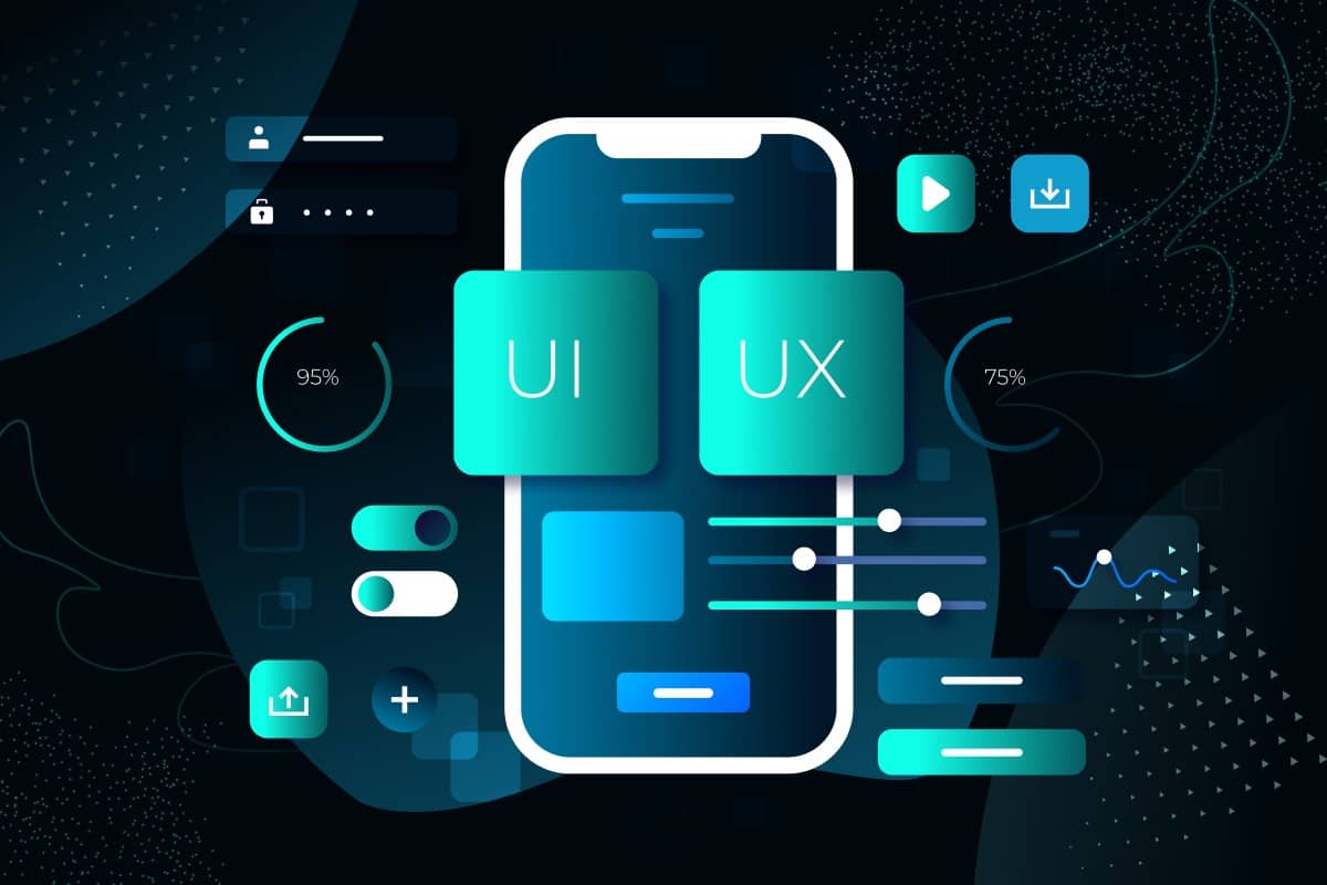
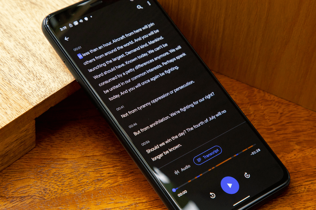
The phrase “dark UI” describes an interface that primarily uses dark backgrounds and other design elements to produce a “dark” color scheme.
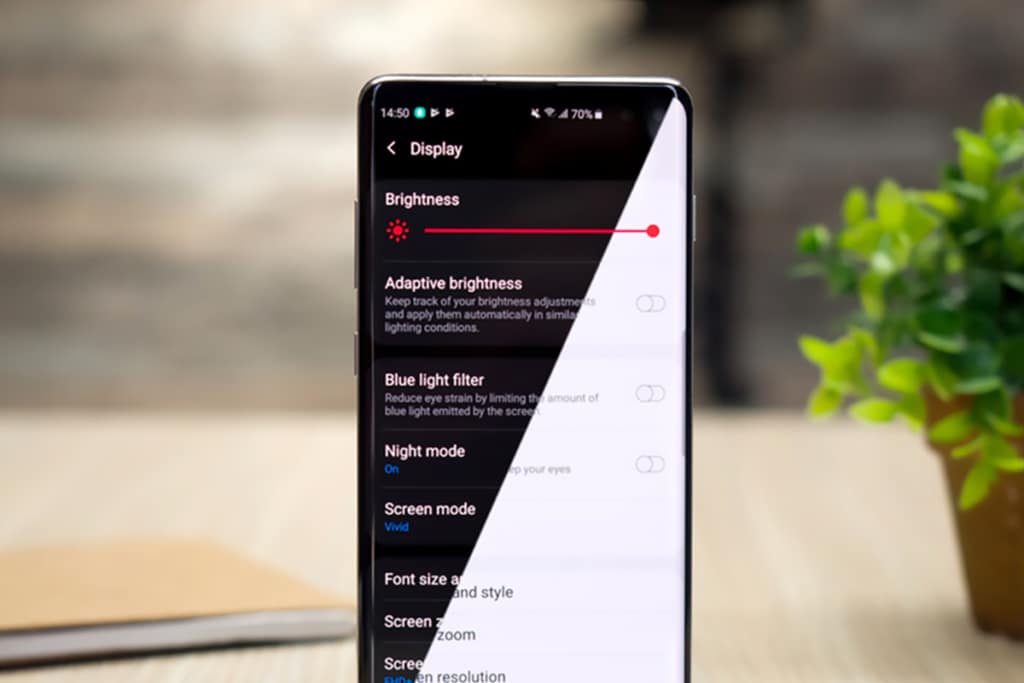
A website or app may use dark interfaces exclusively or users may toggle them using customizable settings. By using less power to display an interface, dark mode UI design can help preserve battery life, minimize eye strain by reacting to ambient illumination, and make it easier to use gadgets in low-light situations.
Advantages of using Dark mode UI design
Apps first incorporated the dark UI feature to lessen eye strain. Additionally, some websites with dark backgrounds remove their distracting white areas, which improves focus.

If you use this at night, there is some slight irritation in the eyes. One of the reasons dark mode has a health advantage is because it causes this pain. Even during the day, the dark mode is less painful than the standard views.
Dark UI vs Light UI
Not all user interfaces work well with dark themes. Before settling on one, designers should take into account brand compatibility, cultural acceptability, color psychology, and emotional impact. It’s a difficult act of balance.
A dark theme may be fine for a huge bank’s website targeting the general public, but it may not be good for a financial app aimed at millennials. When all consumers want to do is check their balances and pay a bill, too rich, too dark, and too fashionable design may become more grating.
Dark UIs for B2B SaaS applications are notoriously challenging to develop. Data tables, widgets, forms, and dropdown menus can appear strange on a dark user interface.
Certain brands and products—depending on the kind, context, and environmental factors—are not a suitable fit and may prove to be an insurmountable obstacle because many color schemes don’t function well with dark UIs.
Designers who decide to go headfirst into dark mode UI design without any prior experience may find themselves in choppy, unexplored waters. There are several traps and norms that are broken in the oceans of dark UIs.
There are a lot of benefits to utilizing dark UIs:
- When there are few content kinds and a simple, sparse design
- For the nighttime entertainment apps, it is appropriate for the context and uses
- To achieve a vivid, dramatic appearance
There are some circumstances in which it is not advised:
- Whenever there is a lot of text (reading on a dark background is difficult)
- When there are many different forms of blended content
- When a variety of colors are required for the design
Why do users prefer Dark mode?
Elegant, cool, and sleek describe dark mode. Dark mode radiates mystique, much like your go-to black evening outfit or jet-black sports car, which may be why almost 85% of individuals choose to utilize it.
To satisfy this consumer desire, app developers are going above and beyond, which is fueling the growth of dark mode. More than ever, user preferences and experience are a top priority for app designers
In what other ways has dark mode improved our lives? Let’s look at this…
Boosts sleep:

According to the American Academy of Ophthalmology, you should “switch gadgets to night or dark mode in the evening, which lowers screen brightness and whose warm colors are less likely to deceive your body into believing it’s sunlight” (AAO).
Your circadian cycle can be thrown off and melatonin production, which is our body’s sleep hormone, can be slowed down by too much exposure to blue light at night.
Additionally, the AAO advises against using screens 1-2 hours before bed.
Reduces glare and nighttime eye strain:

When it’s dark outside, reading in front of a bright screen might make us squint and strain our eyes. Users of the dark mode experience less eye strain and better reading in low light. Additionally, many claim that it makes it simpler for them to go sleep and stay asleep.
Using electronics at night exposes you to more blue light, which could disrupt your circadian cycle, thus this may be the case. The science isn’t entirely certain, though, if blue light causes eye strain.
According to the American Academy of Ophthalmology, rather than the light coming from our devices, digital eye strain is caused by the way we use them (we blink less). The strain, dry eyes, and exhaustion that can result from too much screen time can also impact our eyes.
Regardless of the science (or lack thereof), users assert that dark mode improves readability and increases the contrast between the text and backdrop, making it easier to see in low light and decreasing eye strain.
Users claim it lessens headaches from screens:

TheraSpecs examined hundreds of “Top Tweets” on Twitter from 2017 that made mention of dark mode or a dark theme. A little over 63% of users either:
- Mentioned that dark mode was their preferred choice because it lessened the symptoms of screen headaches.
- Because it might improve their health, they preferred to use it on their favorite apps and websites.
Increases battery life:

At the 2018 Android Dev Summit, Google extolled the merits of dark mode to developers, highlighting the improvement in battery life. Your screens’ individual pixels use less energy to display dark than brighter colors.
If, however, your LCD panel is an older model, this rule does not apply. Devices with OLED screens only see increased battery life. Additionally, the advantages are far more noticeable when consumers modify their auto-brightness settings.
According to Purdue University researchers, if a user keeps their phone’s default brightness settings, which are between 30 and 40%, they might not notice a difference in battery life.
According to Purdue, switching from light mode to dark mode only saves 3%–9% power on average for a variety of OLED smartphones when the brightness is between 30% and 50%.
However, if you have your screen set to higher brightness, going into dark mode will result in greater energy savings.
We appreciate that dark mode reduces power consumption, even if the reductions are not always significant.
Things to consider when going for a dark mode UI design?

All design work is centered on the user experience. You can rely on an experienced partner and their knowledge of UI design, but industry expertise is equally crucial.
Platform owners collaborate with developers to produce the best results in addition to allowing dark mode in third-party applications.
Apple is one of the cases where the meaning of UI styling and colors in iOS was altered in the past. “Semantic colors” have been introduced by Apple for frequently used UI components.
The purpose of the change was to balance the iOS application’s appearance and user experience in both bright and dark settings. The iOS interface aesthetic is directly altered by these colors, despite their subpar RGB values. They also assist with the overlay’s wording and color.
Apple also contributed system colors. There are nine standard system colors that support the dynamic and appearance of dark mode design.
In addition to dark design, Apple has added vibrancy and blur effects with iOS 13 that seamlessly match the iOS interface design. Recalling might also improve the design.
One significant point is particularly important to note: a dark mode design affects not just text but also images and animations. Desaturating the background colors will help the graphical material stand out if the program contains a lot of graphical elements. It all comes down to shining the correct light (pun intended) on crucial components.
Use these Google’s dark mode design for material design standards as guidance if you’re still unsure.
Challenges while designing the dark mode UI design

Let’s be real here. Dark mode UI design is quite amazing. Dark design region does come with some difficulties, though:
- Text can be challenging to read: dark user interfaces are not recommended for prolonged reading and may even strain the eyes (which is ironic considering that many users prefer dark mode because it decreases eye strain over light).
- Colors might act differently in print compared to digital: for example, certain saturated colors may look good on a black print design but lack contrast in digital designs.
- Design might feel cluttered: There’s a reason “white space” is called that; design might feel cluttered. Light themes allow for more breathing room, but dark UI doesn’t. The screen can rapidly appear crowded when there are many design components present.
- Colors send different messages: On light backdrops, colors communicate distinct feelings than they do on dark ones. Colors also convey diverse messages. If your color scheme was selected for a light theme UI, you might need to consider widening it if you want to successfully convey your message on a dark background.
- Some users just don’t like it: Light backgrounds are clearly the standard in design, thus it’s uncommon to hear someone criticize a light UI theme. However, some people simply don’t like it. However, some customers have a strong aversion to dark mode, which can harm their perception of your website’s appearance.
How to do it right

In UI/UX design, there are several urban legends. One of them is how the user interface conveys the aesthetics of the product. An interface’s purpose is to convert mental models into visuals.
Designers transform users’ routines, actions, expectations, and thought processes into what is seen on the screen.
Since there are fewer alternatives available with dark mode design, several things could be seen as particularly difficult. Under these circumstances, developing FinTech software is not simple, but it is completely doable.
Start by outlining your company’s objectives and what the application can do for users. Then, emphasize a restriction on the functionalities. Something is useless if it can be used for everything.
Finally, ask queries to your software development partner. The development process design & spec phase is devoted to learning about your product. Your partner can create your app more precisely the more information they have about you, the concept behind the app, and the requirements of your target market.
That holds true for dark mode UI design as well.
Interested in dark mode UI design for your website?
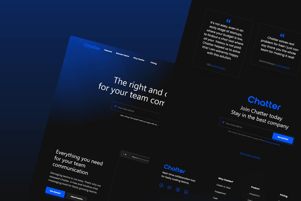
Dark theme web design may be attractive and quite successful in grabbing your audience’s attention when done right. But when done incorrectly, it can be off-putting and challenging to interact with.
Reach out if you’re thinking about redesigning your website or product with a dark UI theme. We’d be delighted to talk about how our innovative and beautiful designs can help you strengthen your brand.